


Responsive Web Design with Reach Career Mentoring


Project Overview
The Problem
Reach Career Mentoring is an organization, founded by Jennifer Yang, to provide career mentoring services for people with disabilities. Jennifer felt that their current website design did not accurately represent their organization's vision due to lack of intuitive design.
Goal
Redesign the navigation structure to support the user experience of people with disabilities in understanding the hierarchical importance of website navigation with WCAG standards in mind.
Role: Website Designer, Accessibility Advocate
Location: Remote
Timeline: October 2022 - January 2023
Reach Career Mentoring
Desktop Design


Mobile Design


.png)
Meet the Founder of Reach

Jennifer Yang
Jennifer Yang created Reach in 2021 when her husband, Hoa, developed paraplegia. As a result of this event, she became inspired to create a volunteer network of mentors for students with disabilities.
Outside of focusing her time on Reach, Jennifer spent 20 years as a pediatrician and is currently a physician in San Francisco. Her passion and hope to support families with disabilities extends far beyond Reach.
I arranged a meeting to get to know Jennifer and her story. I created a list of questions to understand the client and her needs. From our meeting, I about that REACH's intended audience was phone users, people with disabilities, or people who might be connected to others with disabilities.
Thus, we began to explore the user needs and user experience of the website.
Current Pain Points
-
Too many menu options
-
Overwhelming amounts of text
-
Text organization
-
Navigating to "Contact" page
Client Needs
-
Intuitive website design
-
Responsive web design for mobile device users
-
Visual high contrast
-
Meeting WCAG standards
Empathize
Meet The Target User
Zoe
.png)
Zoe is a 17 year old senior in Menlo Park High School. She was always excited about marine biology and hopes to study this in college. She was involved in a car accident at the age of 13 and has since been in a wheelchair. Zoe is an outgoing person who cares a lot about her friend circle. At times, she feels insecure because she isn't able to do all the activities that her want to do.

Empathy Map

Mira

Mira is a mother to her 2 daughters, Sarah and Rosie. When Rosie was born, they discovered that her legs weren't working. Rosie is now 7 years old, and entering 2nd grade. Her partner works as a manager of a coffeeshop while Mira stays home to take care of the family. Mira is constantly looking for new ways to create communities for her daughters. She loves spending time with her family.
Empathy Map
Define
Defining the User Pain Points
Previous Website Design
In order to understand company's mission and current branding, I explored the company's previous website. During this process, I made note of design choices.


User Journey Map
Using the user personas, I decided to create a User Journey Map walking through two of the primary website visiting purposes: exploring the website, and connecting with mentors and resources.
.png)
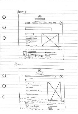
Paper Wireframes of Previous Website Layout
Empathizing with the frustration of the two personas, I began to investigate the design choices of the website and whether or not the UI helped aid an intuitive user experience flow. In this process, I transformed each of the web pages into paper wireframes in order to focus on the information architecture and analyze the consistency within the page layouts.
Dotted red line to indicate a page break on a standard 1920 x 1080 desktop web page
.png)
7 Menu Items
+ 3 when expanded
Center Aligned
.png)
Center Aligned
Left Aligned

Extra space
Center Aligned
.png)
Center Aligned

Center Aligned
Center Aligned

Left Aligned
Observations
Intuitively, the first thing I noticed upon visiting the site was the header section. The proposed menu design had 7 menu items visible and a drop-down carrot, which expanded to show 3 additional items. While each page served a purpose, the number of menu items seemed overwhelming and created a cluttered feeling, especially as a new user looking to learn about the organization's primary webpages (home, about, get involved).
While I thought a majority of the pages did tell a compelling story, the design inconsistencies (font size, left vs center alignment, etc) took away from the overall effect.
In addition, bulk of the content came after the page breaks, which many of the users might miss without taking the extra step to scroll.
Thus, I gathered my observations and presented them to Jennifer.
Insights
1. Too many menu items
2. Design Inconsistencies
3. Bulk of content falling after the page break
Improvement Opportunities
-
Re-evaluate menu items and prioritize top 4-5 menu items
-
Create a style guide for buttons, typeface, font size, color, etc.
-
Reduce content and re-arrange page formatting to display primary content before page break
Next Steps
After I had collected my observations and created a site map to organize the information architecture for the site, I arranged a meeting with Jennifer to communicate my findings and suggested design revisions. We decided that the most important pages for clients to interact with should be: Home, Meet the Mentors, and the Contact page.
.png)
Ideate
Brainstorming Designs
Using the Crazy 8's design exercise, I created a list of primary features necessary on each webpage and began coming up with paper sketch wireframes.
In this process, I quickly learned how intuitive design would benefit users from all backgrounds, including users who might need a keyboard navigation system.
Though there weren't too many actionable items (buttons) for users to click on, navigating the menu was a critical part of the intuitive design.
 |  |
|---|---|
 |  |
 |  |
 |
|
|---|
|
|
|
Design
Creating Wireframes
Figma Wireframes
My next step to redesigning the website was to convert my paper wireframe sketches into Figma wireframes.
I could more easily see the layout of the pages. This allowed me to focus on the user flow first before making stylistic/UI decisions.
 Meet the Mentors |  Home Page |  Contact |
|---|---|---|
 About |  Donate |
Desktop Wireframes
Mobile Wireframes
 |
|---|
 |
 |
 |
 |
Creating a Style Guide
While discussing branding and style expectations with Jennifer, I learned that the "aesthetic" experience that a typical user has can seem quite different from what the most accessible experience would make. Rather than filling the website with bright and bold colors, Jennifer and I decided to pick colors that would create the most contrast (Black, White, and a cool toned Blue).
Black and white would be the most prominent colors on the site, while the blue would act as an action button indicator.
Once I completed the style guide, I ran the document through the A11y - Contrast Checker (AA and AAA compliancy) to double check the color contrast for accessibility.

Test
Usability Testing & Accessibility Check
A critical part of this research became ensuring that the users that the website was designed for would be able to access the information and use it's features through a screen reader and keyboard navigation tool.
Prior to conducting the usability studies, I used the tool Siteimprove to check for the website's SEO, accessibility score, and page optimization.

After collecting the insights from the report, I made adjustments to the UI button components to meet the AAA contrast needs.
As a result, I made iterations on the UI button components.
Primary Button & Ghost Buttons- I changed the color from light blue to white to create greater contrast
Secondary Button - As the "hover" function, I decided to standardize the colors used in buttons to match the same color as the primary button.
.png)
Final Product
With the finalized Figma wireframe, I implemented the style guide onto each web design. I felt that the website design should be kept simple for new users to really grasp the mission of REACH. At its current beginning stages, REACH did not require too many features. Working with Jennifer, I learned that in order to engage with potential users, we needed to focus on the storytelling of how REACH became about and provide a connection between potential mentees and mentors.
As the organization grows, I hope to support any new developments and ways to support clients through design.
Reach Career Mentoring
Desktop Design
Mobile Design
Reflection
Challenges
-
Researching accessibility needs and WCAG standards
-
Finding visual aids to support the website due to lack to photo content/media
-
Matching mission and branding of REACH
-
Reducing visual clutter and keeping the design very simple
What's ahead?
-
Coordinating with REACH to support their upcoming calendar feature
-
Expanding the website to include a blog
-
More use of media relating to REACH
Takeaways
-
Review the company's mission! Prior to the phone call with Jennifer, I had already explored the website to gain a general overview of their current stage and potential needs. I was ambitiously considering a completely different style guide. However, as I began to ask Jennifer more questions on the purpose of her site, I quickly realized the importance focusing on keeping the site accessible.
-
Intuitive design benefits all users. Aside from working to ensure the user flow journey from my perspective was coherent, I learned about different accessibility tools provided for designers to check AA - AAA contrast and accessibility standards. Though some might argue that the visual representation of the website more seem more rudimentary, navigating the website was undeniably easier.
-
Don't be afraid to ask for help or resources. Research is important! At the beginning of this project, I had assumed that I had all the tools necessary to support REACH. However, I quickly realized Jennifer's knowledge in accessibility coming from her & her husband's personal life experience provided me with insight that would have never crossed my mind as someone without disabilities. This inspired me to research more about web accessibility in general and I was able to stumble upon a plethora of amazing resources.