
.png)
Empowering your local neighborhood through music!
.png)
.png)
.png)
PROJECT OVERVIEW
Role: UX Designer, UX Researcher, Product Strategist
Location: Remote
Timeline: October 2022 - June 2023
**California Health Care Foundation
PROBLEM
61% of young adults (18-25 y/o) report high levels of loneliness after the pandemic
GOAL
Young adults in Seattle want a way to form interest-based online connections to connect in their local community.
SOLUTION
.png)
.png)
WHITE PAPER RESEARCH
Desire to connect within their local neighborhood
In 2021, Nextdoor, a neighborhood app, found that
61% of 14,900 global participants,
felt it was more important to build connections in the neighborhood than outside of their community.
In addition, according globalwebindex.com, 77% of online community users to engage in online communities to learn new things bond over shared interests.
.png)
PRIMARY RESEARCH
Online connection can be intimidating
In order to understand the pain points of online community users, I surveyed 15 participants that used online communities (ages 23-32) on their experiences.
User Interviews
User Pain Points
Social Anxiety
High Expectations (Romantic)
Decision Paralysis
Lack of trust
Lack of instant connection
User Research Insights
In order to meet user research findings, I decided to shift Groovi's vision to allow users to:
-
Bond over similar interests (Music)
-
Allow for discoverability
-
Connect with a local online network
-
House virtual connections (avoid in-person high expectations)
COMPETITIVE ANALYSIS
Direct competitors struggled to create a memorable social connection experience
.png)
I decided to evaluate the strengths and weaknesses of direct and indirect competitors including:
.png)
Competitive Analysis Results
Strengths
Weaknesses
-
Intuitive streaming
-
Strong branding
-
Simple/clean UI
-
Search bar accessible on all pages
-
Lack of CTA buttons
-
Non-intuitive social networking options
-
Limited to close friends
-
User is not able to filter by interest
-
Too many features on the home page (what is the primary flow?)
Top HMW Questions to consider while designing
After brainstorming a few HMW questions, I picked 3 that were the most applicable to user pain points of online connections uncovered by my earlier user research.
How might we allow users to discover grooves based on their personal interests?
How might we allow users to connect with neighbors through their shared interests or experiences?
How might we allow users to navigate information without being overwhelmed by the data?
Defining the User's Painpoints
PERSONAS


Users' primary pain point include site navigation and filtering.
JOURNEY MAPPING

Using Cassandra's user persona, I created a User Journey Map walking through two of the primary website visiting purposes: discovering a new groove, and connecting with a local neighbor.
Cassandra's pain points:
"I don't want to have to talk to any strangers. I barely know these people"
"There are too many options for music to choose from. How do I even start?"
It's a lot easier to talk to people when you have something in common."
Cassandra's pain points were pivotal in forming my Problem Statement and How Might We Question.

User Problem Statement
As a shy music enthusiast, I want a way to overcome typical barriers of the online community platform experience so that I can connect with my neighbors through a common interest.
How Might We Statement
How might we design an inclusive tool that aims to break down barriers of online connection within a local community?
Ideate
CRAZY 8'S
Using the Crazy 8's design exercise, I created a list of primary features necessary on each webpage and began coming up with paper sketch wireframes.
While designing Groovi I made sure to keep in mind the primary use case (discovering & joining grooves).
.png)
USER RESEARCH
Before I began designing my lofi wireframes, I decided to focus on understanding user intuition in navigating Groovi features by conducting a card sorting and tree test activity with the tool Useberry.
Card Sorting Categories
Profile, Friends/Sharing, Social Media, Community, Recommendations, Random, Actions, and Listen/Tune-In
.png)
Tree Testing Results
Users struggled with task #2 (send a friend a song), thus I decided to iterate on the site map path to allow users to send a song through the friends page.
Groovi Site Map
With the card sorting and tree testing research data collected on Groovi's navigation & organization, I finalized the site map.

Design
WIREFRAMES
My next step to redesigning the website was to convert my paper wireframe sketches along with my research data into Figma wireframes.
Mobile Wireframes
View lofi designs on figma file.
 |  |  |
|---|---|---|
 |  |
 |  |  |
|---|---|---|
 |  |
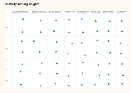
USABILITY TESTING
Users required clarification on specific brand language
Once I created my lofi prototype, I recruited 7 participants to test out the 8 primary tasks of Groovi:
-
Using the "Recommended" browsing feature, filter the results to sort by distance and "Disco" songs genre
-
Join another neighbor's groove and queue a song through the suggested songs function.
-
Use the "Mood" setting to browse and join a "calm" groove
-
Please try to create a New Groove.
-
Now that you've created your groove, click on your groove and add a neighbor
-
Locate your "Liked Songs" and share one of the songs by copying the link.
-
Send a GrooveStation friend a song in the messages feature
-
Use the search bar to find your neighbor Lilygirl1279
.png)
.png)
.png)
4 Major Screen iterations
After several rounds of iteration, I reviewed all screens to eliminate any design inconsistencies.
Finally, I revisited the HMW questions established in the define phase of this project to evaluate the efficiency and success of Groovi from start to finish.
How might we allow users to discover grooves based on their personal interests?
How might we allow users to connect with neighbors through their shared interests or experiences?
How might we allow users to navigate information without being overwhelmed by the data?
Home Screen Iterations
While iterating on the home screen, I wanted the focus on the first HMW solutions to "discover grooves based on their personal interests" in addition to the third statement to navigate information without being overwhelmed by data.
.png)
Iterated initial browse feature into a top nav menu, thus taking up less space & putting it lower in visual hierarchy to allow users to still easily view main feature: grooves list.
Reduced two separate filter options into one "filter by" tertiary button.
Groove Screen Iterations
For the groove screen, I wanted to focus on navigation, sorting groove information and connecting easily with neighbors, thus providing a solution for Users to connect with neighbors through their shared interests or experiences.
.png)
Moving "Leave groove" and "Groove Settings" to kabab menu for general groove actions/information.
Removed next song preview since most users (other than the groove host) would not be able to use the swipe to skip feature.
Condensing "Previously Played" and "Queue Song" to just "Queue Song" which expands on "up next" and "previously played".
Added text field entry to directly submit comment (user goal: easily connect with neighbors)
Mood Screen Iterations
I iterated on the Mood Screen to ensure that users could meet their goal of discovering new grooves.

Moved the Search bar to the same card as "Now Trending" to create more space for #Mood board display.
Rather than the initial scroll interaction to reveal more trending moods, users are able to visually recognize which #mood trends more.
User is able to view a list view of trending moods by clicking on the sideways kabab icon, should the list be extensive.
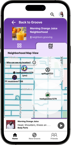
Friend Screen Iterations
In order to allow users to connect, I create a friends page, I iterated on the different features within the friends screen, working to answer "How might we allow users to connect with neighbors through their shared interests or experiences?" through the chat features.
.png)
.png)
OOPSSSSS... forgot about the requests screen! (Refer to screen below)
Dropdown icon to collapse and expand the Online Friends list, to eliminate pain point of excessive scrolling if the user wants to only view offline friends.
Changed "Offline" friends to comprehensive list of "All Friends" for user to view.
Due to "Requests" being added as a new feature, "Add Friend" button turned into a CTA and moved towards the All Friends section.
When I designed this earlier, I neglected to think about the full experience of the user's connection flow including: adding friends, chatting friends, and receiving friend requests.
Final Product

Groovi
Final Screens
 |  |  |
|---|---|---|
 |  |  |
 |  |  |
 |  |  |
 |
Reflection
Challenges
-
Allowing the user to connect with other local strangers while protecting user data(location)
-
Creating a filtering system that was intuitive
-
#Mood feature screen did not have a very visually engaging UI (view iterations)
-
Deciding which screens would benefit with an additional page-specific search feature.
What's ahead?
-
Considering AI implementation into the #Mood feature
-
Expanding the product for a potential market as a startup
-
Conduct user studies to understand tooltips vs user onboarding experience
-
Creating more structure and regulations around #mood
Takeaways
-
Research the Market I began my vision for this design to connect people in real life. However, during my user interviews, I discovered the many pain points of connecting users in real life and the pressure of social expectations. Thus, I adapted my vision to primarily focus on online connections within the local community, rather than directly connecting users in-person.
-
Don't forget about the perspective. After completing my first round of wireframes, I discovered that I had left out several parts of features on a few screens. For example, my initial design for friends did not include a requests section. This was an example of the perspective shift from friend request sender to friend request receiver.
-
The Power of a Design System I was extremely excited and immediately started designing on Figma once I felt comfortable with my research and paper wireframes. At the end of my first round of lofi designs, I had somehow created over 60 screens. With design inconsistencies in place, editing a single feature on every screen took forever. It wasn't until the last 2 rounds of the final iteration that I decided to create a design system. Oops!