

.png)
Exploring your emotions through art

HackSEA 2022
1st place winner
.png)
.png)

.png)


Project Overview
The Problem
As part of the 2022 HackSEA Hackathon sponsored by Amazon, we worked to solve the question,
"How can we remove barriers to accessing mental health professionals for the student population to reduce depression, anxiety and suicide?".
Meet Our Team
Project Vision
Goal
With the potential to impact 5,351 middle school students in Bellevue, Washington, our platform hopes educate students on mental health lexicon through art while combating the stigma against mental health by bringing as sense of belonging and awareness through the shared community stats on the app.

Role: Impact Advocate, Product Designer
Ranking: 1st Place @ #HackSEA Hackathon
Location: Seattle, WA
Timeline: October 29 - 30, 2022
Currently building and iterating for functional app release in May 2023.
Design Process
Empathize
.png)
Define
Ideate
Design
Test
Empathize
Meet The Target User
User Research
-
According to NIH-submitted study, Stigma-related behavior is barrier to seeking help
-
Within Bellevue, 35% of students have reported symptoms of anxiety and depression
-
71% of heavy social media users reported feelings of loneliness
-
Dan Siegel (Clinical Professor of Psychology) developed the school of thought "Name it to Tame it".
"When you experience significant internal tension and anxiety, you can reduce stress by up to 50% by simply noticing and naming your state."
.png)
Meet The Target User
Involved Audience
-
Students (Target User)
-
Parents/Guardians
-
Provider/Admin

Competitive Analysis
I gathered data and performed a competitive analysis on 2 indirect and 3 direct competitor apps based on first impression, kid-friendly language, accessibility, navigation, and membership.
Research Findings: I found that while the competitor apps have relatively clean user flows, they generally lacked in easy-to-understand language and a simple user flow to highlight the primary function. As a result of overloading the student with too many options, they might face decision paralysis and lose interest altogether.
In addition to providing an app that specifically focused on developing users' mental lexicon, we wanted to support users by creating a community space for users to feel connected to their community. Studies have shown that as humans, a sense of belonging is crucial towards our mental health.
.png)
1
Main User Flow
Using Stella's Persona, I facilitated a discussion to create a user journey map of a user pain points that a one might have while using our potential prototype. This helped us outline potential solutions to pain points.
.png)
2
Outlining the User Pain Points
-
Tedious user process to reach home screen
-
User feeling intimidated and isolated in negative emotions
-
Difficult language to understand
-
Decision paralysis for which emotions they're experiencing
-
User experiencing guilt for not using the app
3
Improvement Opportunities
I used the following improvement opportunities to analyze my design's success at end of the design process.
1. Simple design and user flow process to avoid user intimidation
2. Stray away from unethical marketing strategies for user engagement (Encourage the user the use the app vs apply shame/guilt)
3. Scaffold the process to learn emotional lexicon to allow for user success to be more attainable
.png)
Ideate
Creating Paper Wireframes
In the Ideate process of the design, we began to brainstorm features that we envisioned for our app.
After deciding on the general features, we each drafted wireframes to address the user pain points using the Crazy 8's Method. Finally, we shared our wireframes in a Round Robin exercise and merged some ideas to form our low fidelity prototype.

Home screen should be a simple visual image to not obscure the purpose of the app

We wanted community involvement and a general screen to showcase how other users contribute to the statistics.
In addition, having a profile page to customize certain features would allow the user to cater the app to their enjoyment
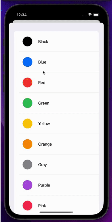
Simple drawing interface with options to change colors to support the idea that the drawing process should not be too in-depth and is only part of the educating aspect.
Design
Art to Heart App Prototypes
Low Fidelity Prototype
(Created with Figma)

Test
Insights and Iteration
User Testing
Due to the brevity of the Hackathon, we were unable to test the prototype on real users. However, based on our Team members' feedback, we came up with the following iterations.
Insights
1. Users want an option to view previous community stats

2. Navigating the emotion selection screen as an emotions "map" feature (should the user choose a different quadrant) was not intuitive.
Design Iteration
We created an option for users to navigate between different days within the community stats by sliding or clicking.
.png)
We redesigned the emotions map to focus on the quadrant that the user selected. We decided to include information from another quadrant to inform the user that there was a way to drag the map to select other emotions as well.

3. The QR code pop-up seemed clunky and lacked instructions for the user.
.png)
.png)
To clarify things, we reconsidered the information architecture and added a confirmation message of redeeming the user's reward
.png)
Navigating User Pain Points

Challenge #1 - Design with simplicity in mind to avoid user intimidation
We decided to focus on a minimized user flow to focus on the primary feature of the app. In order to create a product with the most viable product (MVP) in mind, we honed in on the 3-4 primary features on the home screen. The product started with 7-8 features, but as we built the prototype, we used post-it notes to organize our thoughts and prioritize the features for the MVP and found alternative placements for the non-primary functions.


Challenge #2 - As a mental health app, stay away from unethical marketing strategies for user engagement (Encourage the user vs shaming/guilting)
Rather than creating a reward system through consecutive day "streaks", we decided to reward the user based on cumulative entries. This would encourage users to interact with the app without feeling ashamed of missing any days.
.png)
Challenge #3 - Scaffold the emotional lexicon learning process to allow for success to be more obtainable in users.
Based on my experience teaching, I made sure to scaffold and sequence the process of reaching the learning goal (users will be able to define emotional lexicon). Here is how the goal is broken down for students:
Screen 1: Create a personal connection/anecdote for users to understand
Screen 2: Introduce broad concepts of the Energy Quadrants to assist students in filtering their emotions without feeling overwhelmed by having too many options


Screen 1
Screen 2
.png)
Screen 3
Screen 3: Students are prompted to select emotions based on specific energy zones along with their emotion definitions.
High Fidelity Prototype
(Created with Figma)
After completing a series of iterations, I decided to begin designing my high fidelity prototype by including specific icons, images, colors, and pictures to improve the user experience.

Communication with Developers
As we worked to design paper wireframes, it was important to communicate with the developers to make sure that all the features would be feasible to code. In this discussion, the developers decided on using SwiftUI to construct the drawing component for our app.
Final Product


Reflection
Challenges
What's ahead?
-
Seeking private and public funders
-
Adhering to minors' personal information & other privacy standards
-
Creating an educational app that would be engaging for younger users
-
Working on the same page with another designer to come up with the steps to begin our design process
-
Expanding the community function to include others' paintings as well as community emotion statistics
-
Implementing emotion management strategies
-
Analytics of drawings and emotion history
-
Partnering with providers and schools
Takeaways
Throughout the process of designing Art to Heart, I walked away with these 3 major key takeaways:
-
Communication is key! - This being my second hackathon, I felt a little more confident in leading the design process. This time, another UX designer was on our team and it felt very validating to that my design process was relatively in sync with hers! There were times in the process when we were not on the same page, however
-
Keeping the MVP in sight- Beginning this project, we were all very excited and passionate about serving the community. However, in the midst of brainstorming, we ended up with 20+ ideas for features to include. A majority of our time ended up being clarifying which features we wanted to prioritize for our MVP in order to narrow down on our vision.
-
Consider the User - Though many of us had ideas to make the app engaging through social media based interactions, we decided against having too many social elements. Many of the reasons that users were typically struggling with mental health issues in the first place were due to having a negative relationship with social media. We didn't want to add or become part of the problem, so we had to constantly think about our general mission and navigate around the toxic styles of engagement.